
Port Color Harmonization Plan
We will make the Port of Shimizu unique, attractive and beautiful, which can be proudly introduced to the world !
This plan is not a part of regulations.
This is a guide plan to make natural and artificial landscapes mix well at the Port of Shimizu.
→
1. What is the Port Color Harmonization Plan?
♦ Increase Amenity Value
For people who live around this port : We will make proud and friendly landscapes.
For people who work at this port : We will create a comfortable work environment.
For people who come and visit this port : - We will make a fun port space.
♦ Increase Vitality
We will make a gathering place for people by giving special consideration to the port functions and the port characteristics.
♦ Create Its Own Characteristics
We will make a unique port, which can be proudly introduced to the world towards the future.
♦ By Efforts of All People
We will proceed to make a beautiful landscape at Port of Shimizu with citizenry participation as well as cooperation from port related companies.
2. Basic Policy for Color Harmization
- Symbol colors at the Port of Shimizu are aqua blue, which was approved by residents and companies, and white.
- Port of Shimizu is divided into 8 zones by its port functions, and this colorization plan aims at increasing its characteristics of each zone.
- The use of color, which is not included in this plan, such as company’s CI color and etc, is accepted as an accessory color.
Symbol Color
This color is representative of Port of Shimizu, and so it will be used at least partly at all of the port facilities.
Base Color
This color will be used for wide area such as roof, wall, and etc.
Highlighting Color
This color will be used for highlighting such as drawing lines and dots.
Accessory Color
This color is the company’s CI color, which is permitted to use as an accessory color. It will be used as lines and dots at a minimum.
3. Applied Area and Facilities
Applied Area: All of the Port of Shimizu (Port area) Area: 500 hectares
Applied Facilities: This applies to all of the buildings, accommodations and facilities at the port area.
4. Characteristics of This Colorization Plan
♦ Mt. Fuji is its keyword
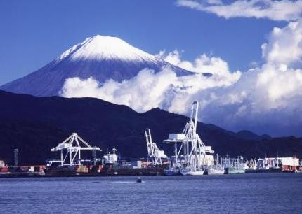
Port of Shimizu has outstanding scenery of Mt. Fuji and he Pine-covered field of Miho, which is famous for an angel legend. This port is therefore one of the most beautiful ports in Japan. Numbers of citizens and business owners wish to maintain and develop the wonderful view of Mt. Fuji.
♦ Consensus-Building Plan
This plan is carried out with the consent of local companies, representatives of the residents, municipal government and academic experts.
♦ Incorporate the Opinions of the Residents
We have a system to understand the ideas of residents and reflect them to the plan.
♦ Symbol Colors
The symbol colors (port colors) leading a unity in the area plays an important role in the port views. One of the symbol colors, aqua blue was selected by resident votes.
♦ Landmarks
Appropriate landmarks for this plan are selected from the characteristics of each area, and they are being repainted. This painting method aimsat making an impact on beauty of the landscape of the surrounding area.
♦ Give a consideration to Company’s Identity
We made consideration to the opinions, identity and characteristics of local companies. For example, we accept the use of their CI colors as accessory colors at the port.
♦ No Bounty System
This plan does not have bounty system and so it is carried out by autonomous actions of business owners. Each business owner is proud of this plan and conducts various activities such as lighting up, following the green land plan, and erecting an appropriate size of their trademark logo up with consideration to the environmental impact.
5. The History of the Beautiful Port Making
Port era that focused on its industrial functions
The Port of Shimizu has outstanding scenery of Japan, such as the world heritage, Mt. Fuji, and the Pine-covered field of Miho, which is famous for an angel legend.
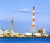
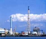
However, the Port of Shimizu was once a dirty and desolate port where red-and-white chimneys, decrepit tanks and warehouses stood out like other ports in Japan.
In 1988, a survey was completed about the scenery of the city and it showed that the Port of Shimizu was selected one of the least favorite views in town. This represents that the Port of Shimizu was a primal industrial foundation but became completely out of touch with the life of its residents.
Ladies Marine Forum
In 1990, Ladies Marine Forum proposed a “coloring plan of the port applying to the functions and characteristics of the area, which harmonizes the natural views”. They suggested numbers of unique and fresh ideas, and these were the primary ideas of the current colorization plan at the Port of Shimizu.
Establishment of Colorization Plan
In 1991, the Port of Shimizu/Port Colorization Planning Committee was formed with some color-and-scenery experts and representatives of the local companies, and they started establishing a highly-practicable proposal.
This plan aimed at investigating the current coloring conditions at the port, setting up the port symbol colors; aqua blue and white, by conducting questionnaires and surveys with residents and local companies, analyzing the functions and characteristics of each port area, dividing the port area into 8 zones and setting up the image colors of each zone
6. Awards
1999 City Scenery Awards
1999 Japan Construction Engineers’ Association Award
2001 Chubu Future Creation Award ”Land Management Category”
2003 Seaside Universal Design Award 2003